Gaia Survey – Identity
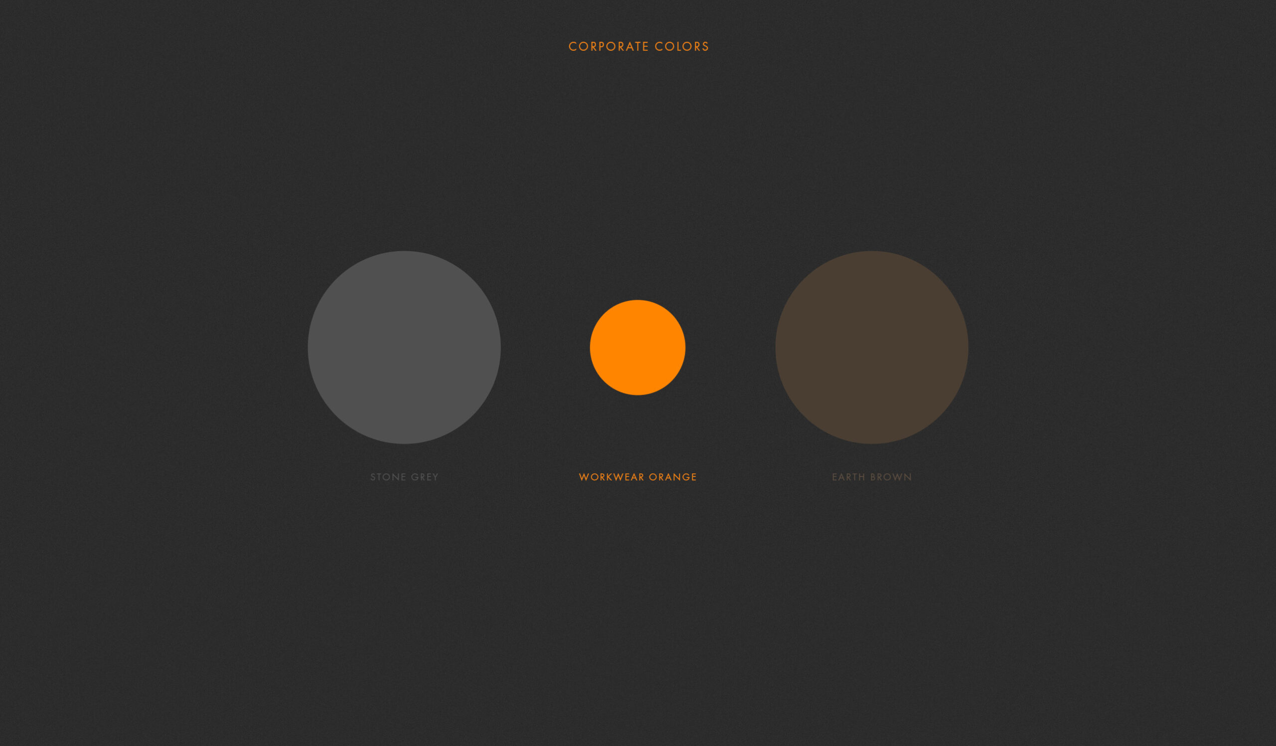
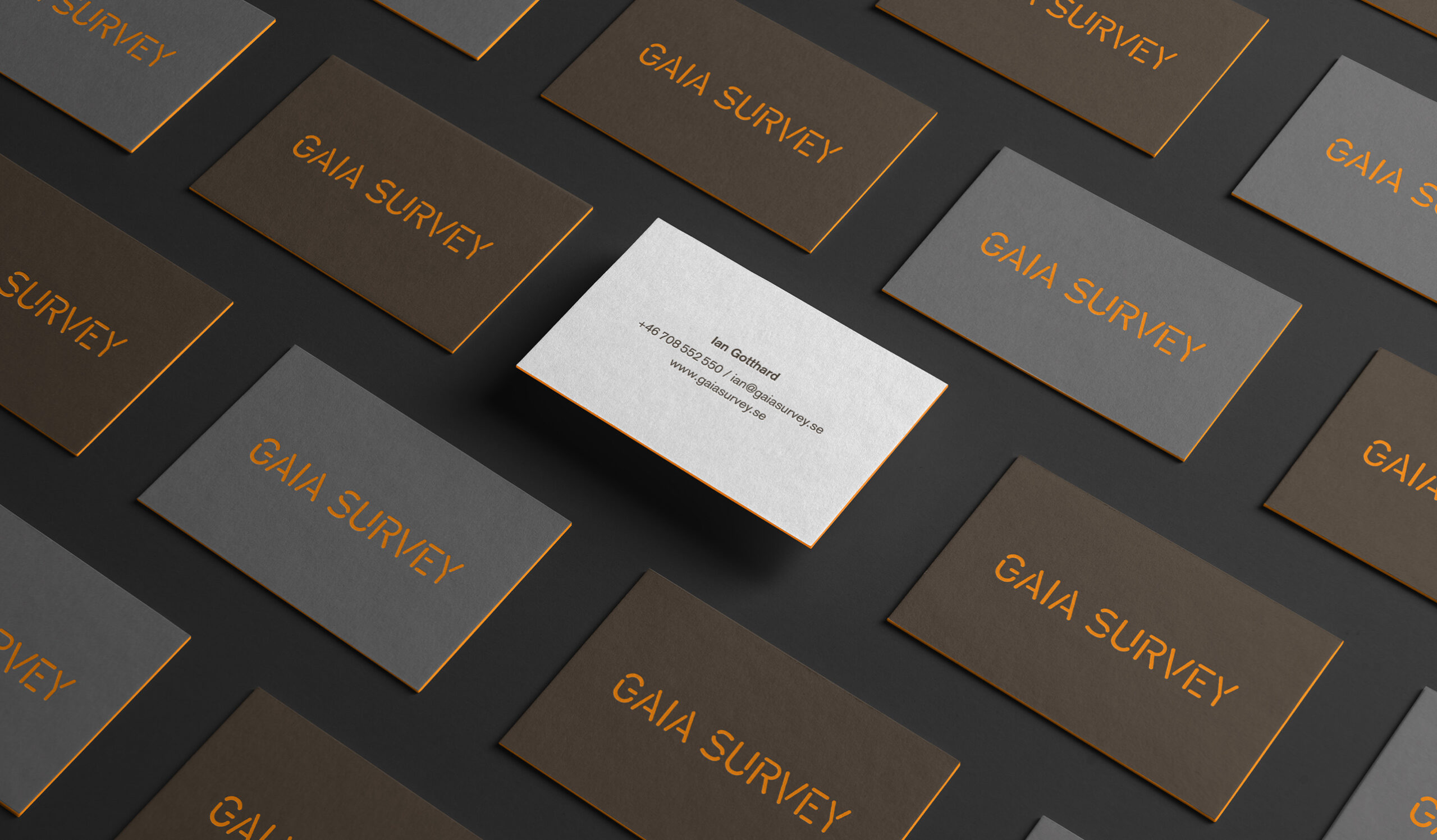
Gaia Survey is a company who are conducting geotechnical fieldstudies. To make a long story short (and very simplefied) they primary business is drilling for earth and rock samples in preparation for different construction projects. The task given was to develop a new identity for them. From the swedish saying: ’Dig where you stand’ we chose to go with colors close their core business – Earth and stone. And of course the signal orange used on the drillers workwear as an accent.
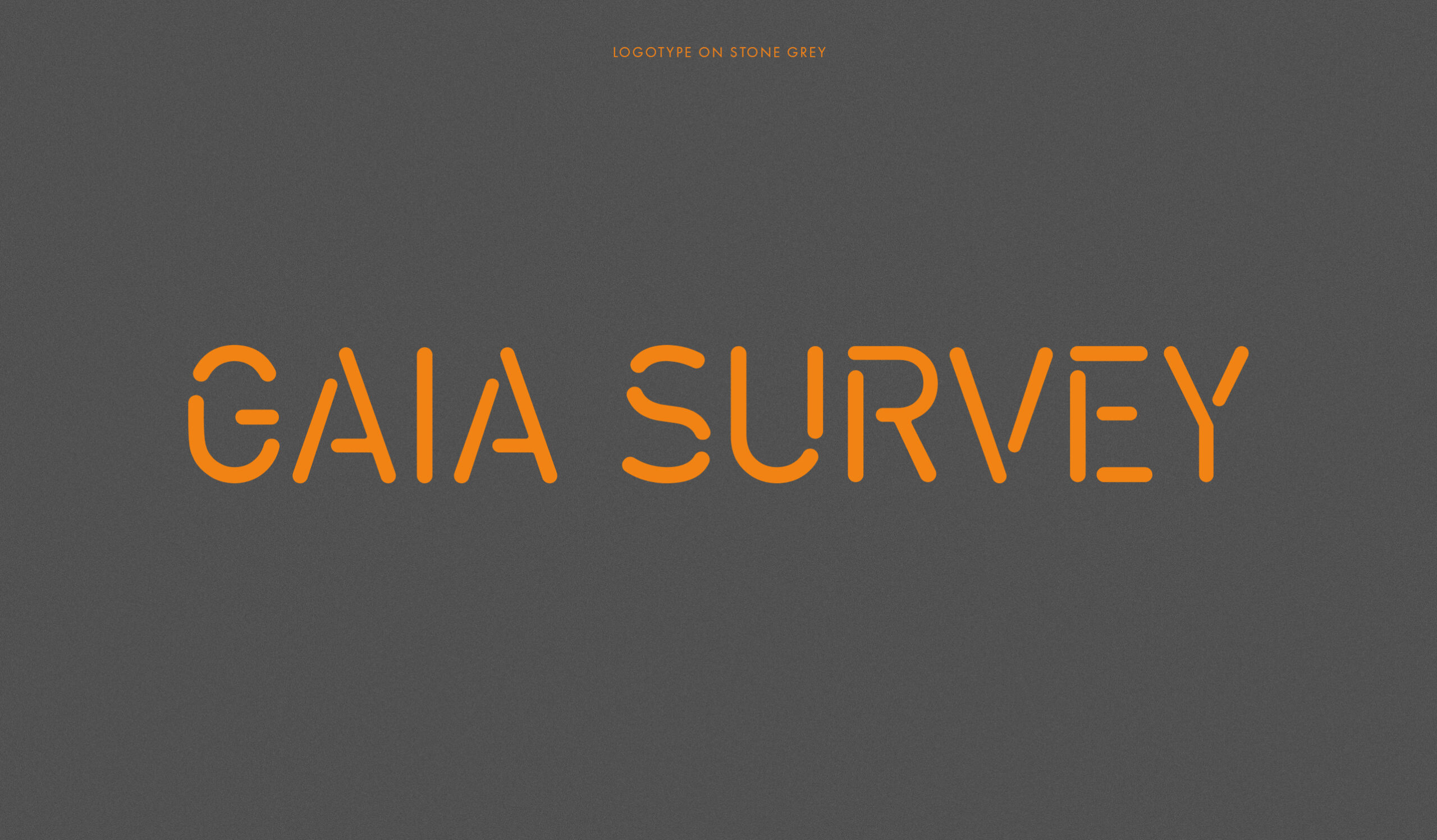
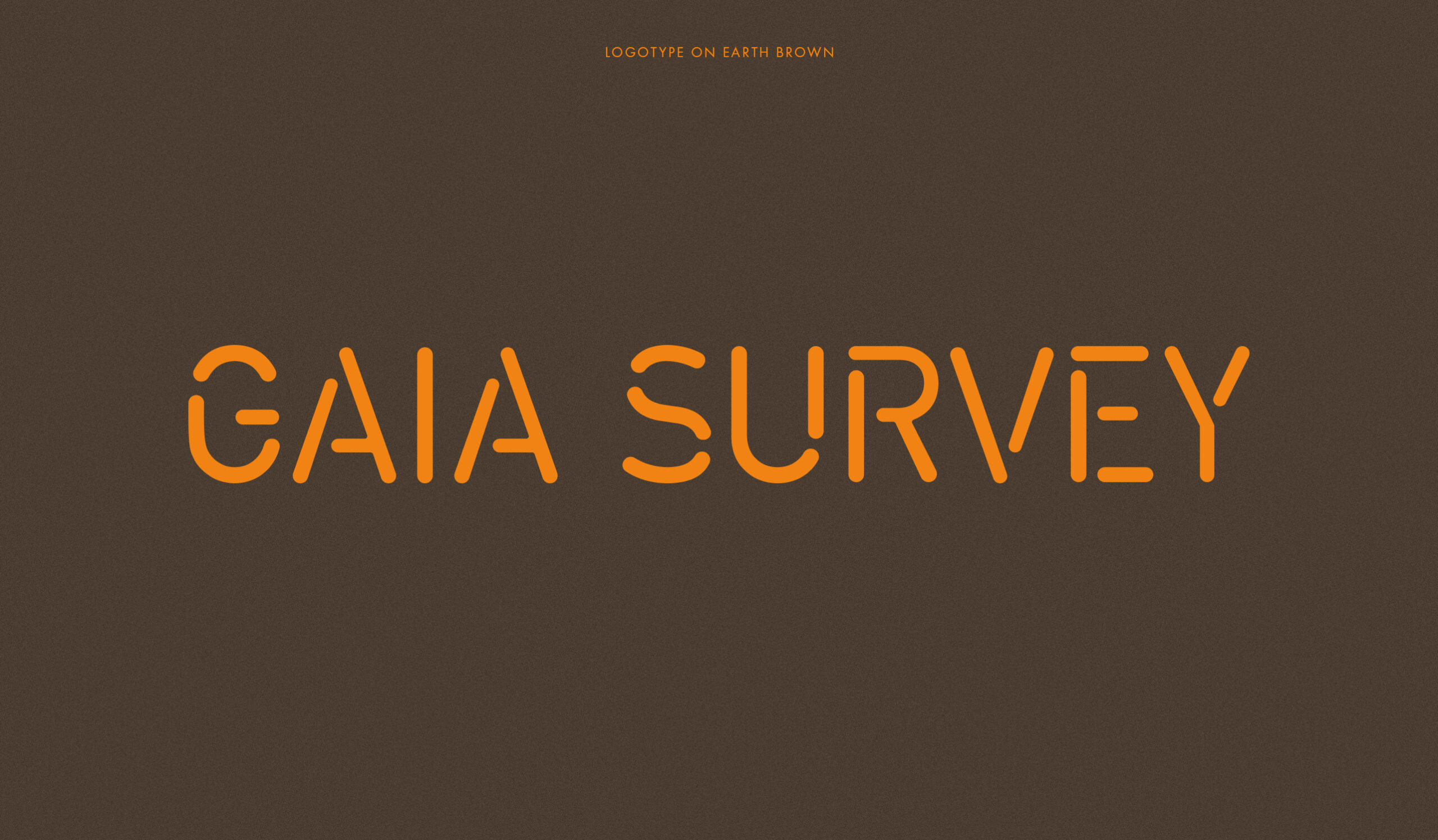
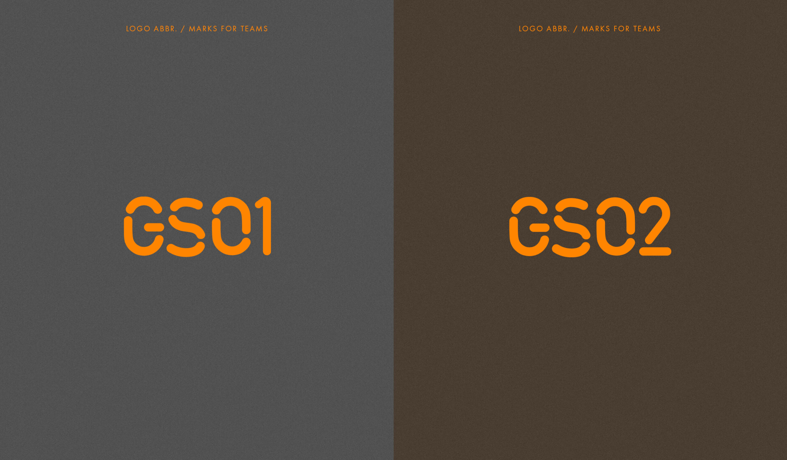
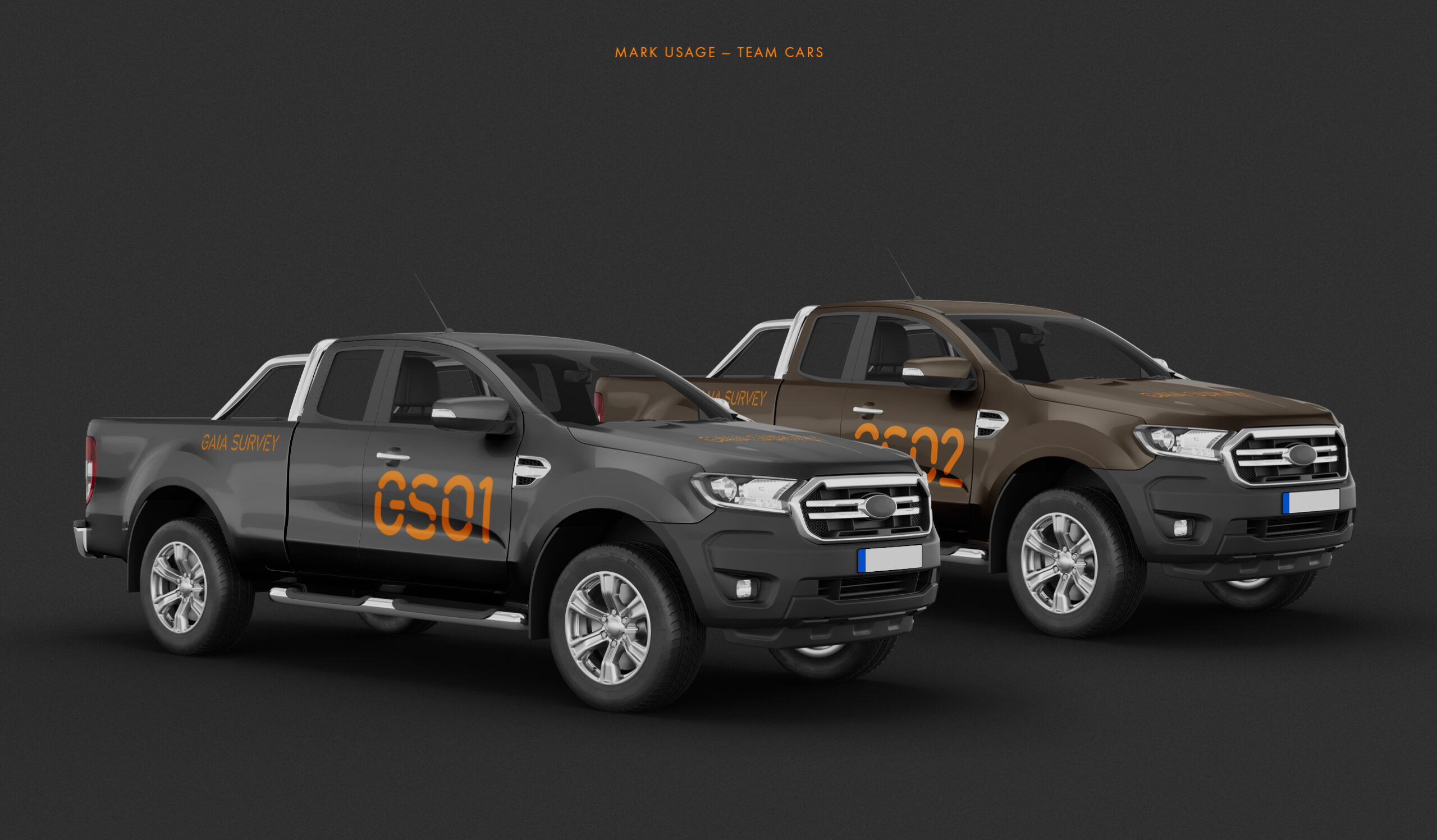
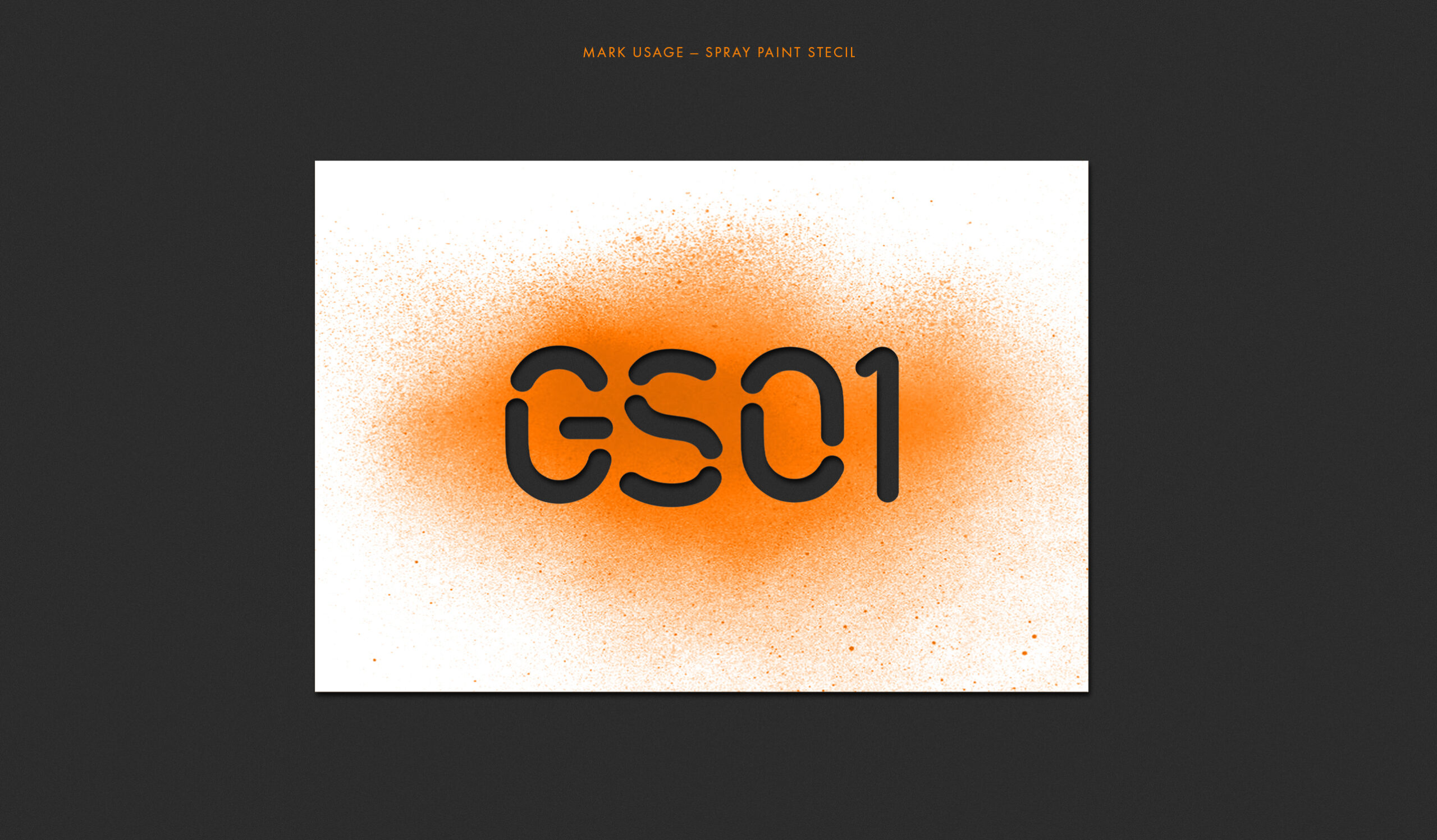
The design of logotype was developed with functionality and usage in mind. And with a short ’team marks system’ for the different drilling crews.
